Learn UX Design: Part One. The Fundamentals.
A simplified way of learning UX Design.

UX defines how the user is experiencing, feeling, and interacting with a product (service or feature).
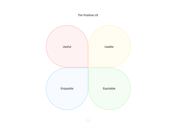
For a user to have positive UX, the product needs to be:
- Useful — Solving a problem.
- Usable — Improving Usability. Making something easier to use. This means clear design, structure and purpose.
- Enjoyable — giving delight or pleasure. Creates a positive connection between the User and the Product. Taking the Users’ feeling and thought in account.
- Equitable — Considering the unique needs of many people, the products must be useful to people with diversabilities and different backgrounds.
The term Diversability embraces the uniqueness and potential in every human being, disabled or non-disabled. Diversabilities refer to physical, cognitive, developmental, learning, and/or neurological differences, or diversity, in ability levels.
Empathy — the ability to understand and share the feelings of another.

To know how users feel and experience the product, UX Designers must do a research and collect evidence.
What is the role of UX Designer?
The role does not bound UX designers to the visual aspect of the design. There are several types of UX designers.
- Interaction Designers — Designing functions and overall experience of a product. Connecting user needs and business goals.
- Motion Designers — Designing animations and transitions, micro interactions
- Visual Designers — Designing how a technology or product looks. They design Brand Identity and Illustrations, Typography and Iconography, Layouts and Colors.
What is the role of UX researchers?
- UX researchers conduct studies and interviews to gather data on how a product is used.
What is the role of UX writers?
- UX writers focus on making the language within a product clearer and contextually correct.
What is the role of Production Designers?
- Production Designers act as a bridge between UX designers and engineers. They match initial and final designs in product library, manage Design System and engineering team handoffs.
What is the role of UX Engineers?
- UX Engineers transform the design goals and ideas into a functional experience.
A key responsibility of UX Designers is to connect a specific emotion to the product experience.
Responsibilities of entry-level UX Designers
- Research — Understanding of audiences, backgrounds, demographics (age and location), motivations, pain points, emotions, and goals.
- Wireframe — Outline or a sketch of a product or a screen. Helps to understand pages and stages arrangement, functionality fit and eventual user interaction with the product. This step is done after or during the user research.
- Prototype — Model of a product where design ideas are implemented into different forms. Can be built at different degrees of fidelity (Low/High) for refinement and future validation.
- Information Architecture — Organization and categorization of information and functionality towards understandable solution.
- Effective Communication — Meetings, digital communication, proposals or client pitch.
UX designers draft a new solution/feature or improve over an existing one. Identifying the problem. Finding the issues and reasons for improvement or introducing something new.
Generalist, Specialist and T-shape roles
Generalist — Broad number of responsibilities. This role is common in small or middle-sized companies without big design departments. Some cases may include:
- User Research
- Branding
- User flows
- UX writing
- Visual design
- Prototyping
- Product design
- Information architecture
- Usability testing
Specialist — Specializes in one particular UX Design role. This role is common in large companies and organizations.
T-shaped designer — One main specialized UX design knowledge and wide knowledge in different areas.
User — Any person who uses a product
End Users — Specific audience of users
The goal of UX designer is to design from an end user perspective and meet the user needs.
User Experience — The way the user is experiencing and feeling about the product.
Goals of a good UX
- The product is easy to use.
- The product is equitable.
- The product is delightful.
- The product solves the user’s problem.
As an UX designer, you are focusing on the End user and balance this with the business needs.
User-centered Design
Focusing on user actual problems reduces the designer bias. Puts the user front-and-center, focusing on the user needs, considering their story, emotions and insights gathered through user research.

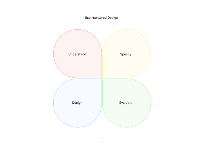
The User-centered design process has four steps:
- Understand — How the user is experiencing the product?
- Specify — Based on user research, specify the end user’s needs. Narrow down which end user problem is the most important to solve.
- Design — Design solutions to the end user's problems. Ideas on how the product might look like.
- Evaluate — Evaluate the design towards end user’s needs. Testing the product with a real audience.
Iterating over in the distinct steps is a key to accomplishing a working solution.
Frameworks in UX Design
Framework — an essential supporting structure. A set of ideas that provide support.
The five elements UX Framework
Steps a designer is taking to turn ideas into a working product. The five element framework moves bottom to top in abstract to concrete manner. Each layer depends on the one below it.
- Strategy — The bottom layer, defining the user’s needs and business objectives
- Scope — Defines what is built. Features and content.
- Structure — Design organization and user interaction.
- Skeleton — Invisible inner-workings and the layout of the product.
- Surface — The top level of the user experience. How the product looks and feels.

Design Thinking
A way to create solutions that address a real user problem functionally and affordably.
Five actionable steps:
- Empathize — Discover what are end user’s needs. Learn how to think and feel like them. Surveys. Interviews. Observation sessions.
- Define — Create a simple problem statement. Clear description of user’s needs that should be addressed. Should be based on user research.
- Ideate — Brainstorming a solution. Focusing on the quantity of ideas, not the quality.
- Prototype — scaled-down version of the product showing important functions.
- Test — testing the prototype with real users providing feedback before a prototype is built.

Universal Design / One size fits all solution
- Creating one product for users with the widest range of abilities and situations. The downside of this approach is the exclusion of specific use-cases. This is not a perfect solution.
Inclusive Design / Solve for one, extend towards many
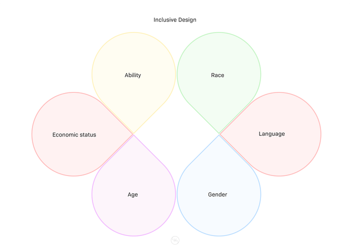
Focuses on design choices through personal identifiers:
- Ability
- Race
- Economic status
- Language
- Age
- Gender
Build experiences accessible to the widest range of abilities. No-one should be excluded. No average person or targeted audience.
Accessibility is the design of products, services, devices and environments for people with disabilities.
- Accessibility is one aspect of Inclusive Design.

Equity focused Design
- Takes idea of Inclusive Design one step further by designing for groups that have been historically underrepresented or ignored when building products. In order to design with Equity focused Design, we have to know the difference between equality and equity.
- Equality — providing the same amount of opportunity and support.
- Equity — providing different levels of opportunity and support for each person in order to achieve fair outcomes.
Instead of building products for groups of people who are currently being excluded (Inclusive Design) Equity focused Design is building products that meet the needs of specific individuals in groups who had being excluded in the past.
Accessibility
- Accessibility — The design of products, devices, services or environments for people with disabilities.
a11y = accessibility. 11 is the number of letters between “a” and “y” in the word accessibility.
Accessibility categories
- Motor
- Deaf or hard of hearing
- Cognitive
- Vision
UX Designers need to account for disabilities that are permanent, temporary or situational.
When designing with accessibility in mind, designers often make a better UX for everybody.
It is important to design with multiple platforms in mind but focus on one that best meets your end-user’s needs. Consistent Brand identity and UX across platforms is expected.
Brand identity — The visual appearance and voice of a company.
Design consideration example:
- Average mobile session is 72 seconds. — Mobile users are focused on completing a single task. Possibility of connectivity limitations, slower processor speed and longer load-times. To create Inclusive Design UX designers need to create for many phones.
- Average desktop session is 150 seconds. — Desktop users are focused on completing multiple tasks.
- Responsive web design — Website UX and UI change automatically depending on the size and type of device. Desktop — multiple columns. Mobile — single column.
Examples of mobile UX practices when designing for mobile experiences:
- Call to action buttons should be placed front and center.
- Navigation menus should be short and simple, highlighting the core functions of the product.
- Use familiar gestures like tapping and swiping. They should be intuitive and familiar to users.
- Design for both directions a phone might be held. Vertical — portrait view. Horizontal — landscape view.
- Reduce visual clutter. Mobile phones have small screen sizes. Keep things simple.
Users behave differently depending on their device.
Assistive technology (AT)
Any product, equipment, and systems that enhance learning, working, and daily living of persons with disabilities.
- Low-tech: Communication boards.
- High-tech: Special purpose computers.
- Hardware: Prosthetics, mounting systems, positioning devices.
- Computer hardware: Special switches, keyboards, pointing devices.
- Computer software: Screen readers and communication software.
- Inclusive or Specialized learning materials or aids.
- Wheelchairs, walkers, braces, educational software, power lifts, eye-gaze, head-trackers and much more.
Assistive technology helps people who have difficulty speaking, typing, writing, remembering, pointing, seeing, hearing, learning, walking and many other things. Different disabilities require different assistive technologies.
There are many people who don’t identify as having a disability but use AT. The reason is that AT provides a better user experience.
AT Design consideration example:
- Color modification — High contrast mode, Dark color mode — increases a contrast on the screen. High contrast makes interfaces easier to see for people with low vision. Reduces eyestrain when reading in the dark or midday.
- Voice control and switch devices — Help people with limited dexterity and can serve as an alternative for keyboard and mouse. Voice control allows users to interact with interfaces using only their voice. Switch is assistive technology device that replaces the need to use a computer keyboard or a mouse helping people with limited motor abilities.
- Screen readers — one of the most common assistive technology for people with limited vision. The software reads out loud text and any interactive elements, buttons and non-visible text.
- Alternative text — helps translate visual user interface into a text based user interface. Describes the context of an image for someone who cannot see the image. Helpful describing interface elements when high-bandwidth connection is not present.
- Speech to text — User composes text by speaking on their mobile phone or computer. The voice recording is automatically converted into text. Use case: Talking to send text message for hands free experience.
Continues in Learn UX Design: Part Two. The Design sprint.
